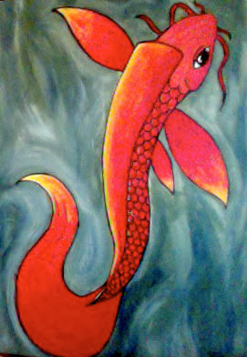
It took me a long time to figure out what to do for my choice project. I Took a previous koi fish drawing I did for homework and used it as my reference and made it into a painting. The outline is used in sharpie. I always forget to do the background first, so i had to go around the fish. Doing so, I like how it came out because there is more texture to the water and makes the fish look like its moving. As well as the tail. Especially how it goes down the back whipping back to the top. Getting the transition to the red, orange and then yellow was difficult, because I wanted it to blend but not so that it would mix. I left the eye blank from paint, because I thought it would pop out and give the fish more of a highlighted realistic feeling. I picked the warm colors in front to make it stand out more making the fish seem like its on the surface of the water. The colors I chose for the water were a mixture of white, dark blues, and earthy greens. Keeping the white around the koi defining ripples and highlights. I was debating on if I should have put a lilly pad with this painting, but I wanted this to be bright and to have one focal point. Im happy with this, because it has a semi-realistic theme and how I used bright colors.
 RSS Feed