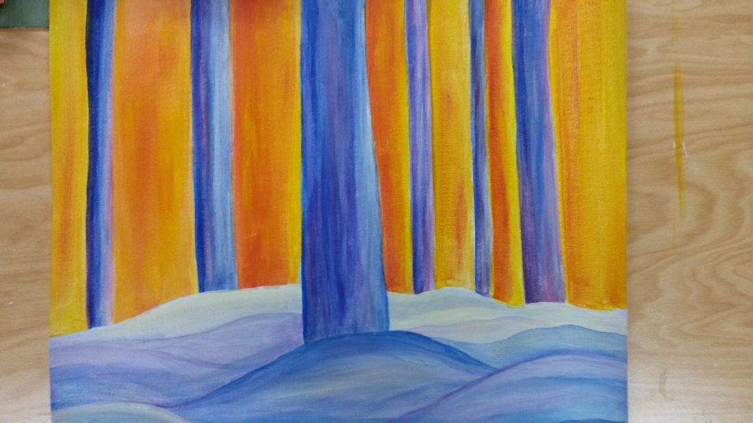
This choice project for me was difficult, because it was more towards last minute. I wish I took the time and thought it through first. I now realize that putting objects in the middle of the paper is wrong. My favorite part about this is the colors of the trees and how it is against the bright orange and yellow. I tried to make the orange sky reflect on the snow, so it would look more towards the end of the day. I tried to make everything in the vertical shape. I didn't put much details in the tree, because I wanted it to look faded and glared and sort of foggy. I thought of this by having a picture from last year of trees and snow. I made this my own. I figured by making the ground bulky it would represent snow. I made the colors dark blue to make it look cold. I also used purples and a bit of red. I also put red into the trees hoping it would make it look like the trees are absorbing the heat from the sun. Through out my piece I enjoy the contrast. I wish I took more time with this. Overall I like it.
 RSS Feed