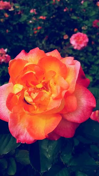
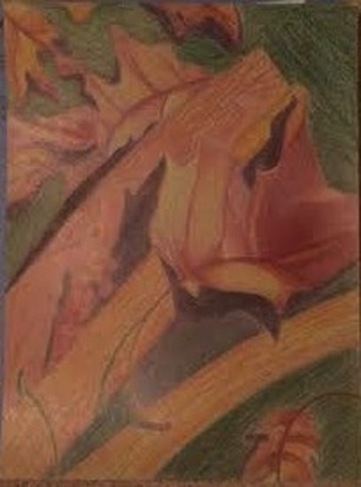
 Although, with the comparison, the photograph is much better. I used oil paints for this project, because I wanted the background to be blended well and to not have much detail. And to the the focus to be extra detailed. Although this project isn't finished, i had to wait for the drying process. I need to add more definition and highlights. At last as it is now dried i can get to that pronto. My favorite part of this was doing the background, because it was fun making dots of different colored paint. It starts out more purple on the top and as it gets lighter it turns yellow in the bottom. I wouldn't say the rose is my favorite, but then again it isn't done. I love painting the leaves, because the combination of green and purple works well. I love the texture of the oils, because it isn't flat. Hopefully I will like this project when it's finished. So far I do. The most difficult part was trying to have bright and pop of color in the rose. I really wanted to capture the reds and oranges in the rose, but it turned into a darker pink. Once i do touch ups i'm sure I can do that. | 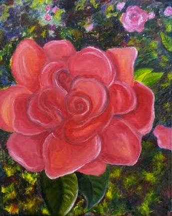 |
0 Comments
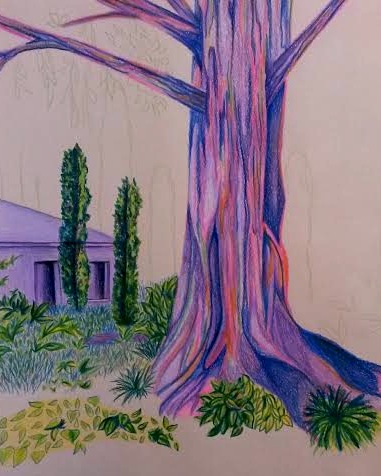
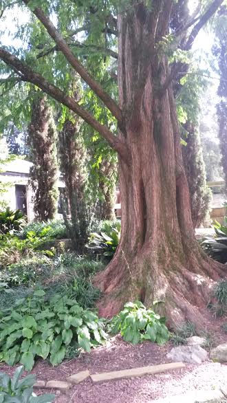
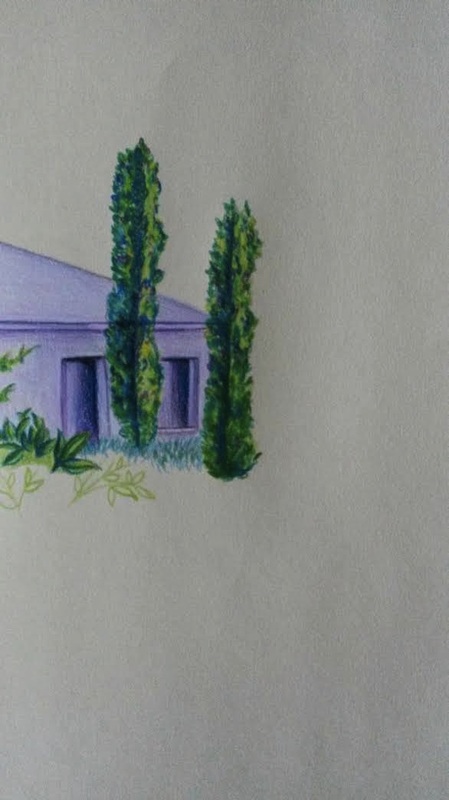
This project isn't finished currently, but i'm excited to complete it!I used acrylic colored pencil. I chose more of light colors. Including purples, pinks, and oranges. The piece looks more colder though, because I also used a lot of greens and blues. As well as turquoise. I chose purple for the building in the back, because it looks further away, I think, with the purple. Especially the darker trees against it. I matched the same color as the building with the tree in front. Yet it stands out a lot, because that is the only place I put orange, blue, and a bright pink. I love how the tree stands out, but I'm also happy that you don't totally ignore the building in the back, in my opinion. I know once i'm done i am going to cut some of the right side of the paper to make it more narrow and to cut the roots more. The type of tree is a seder tree. Seder trees have openings where there branches come out. Also the bark has many sections where it looks split and inward. I placed blues and dark purples in those areas. Obviously where i placed the pinks and lighter colors is the outward parts of the bark. The grass was fun to color because I love the areas that show the opening of the papers color, and then filling it with light greens and blues. When I finish the background with more of the small, taller trees the seder tree will pop out even more. Overall I am very happy with this piece. Completion is almost accomplished.
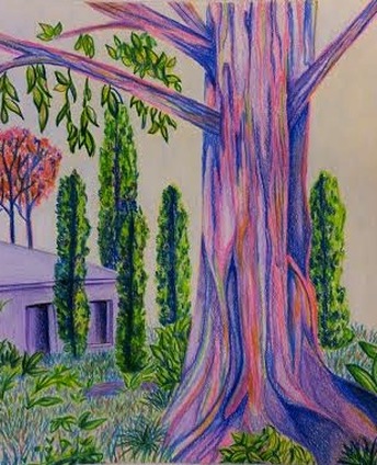
Completion a success! I wish the camera would pick up more of the bright colors. I added the background and more orange trees. I am actually putting this into the Halle show. I hope it is a good choice. I like it a lot. I like how it isn't too crowded with trees and leaves. And i am happy I kept the leaves green instead of doing crazy colors. My favorite part is the main focus, which is obviously the trunk of the tree. i hope you enjoy the transition of color and lines as much as I do. 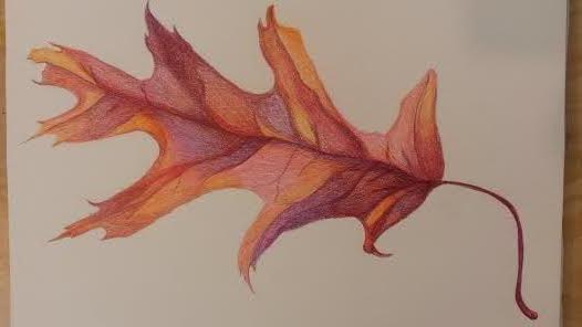
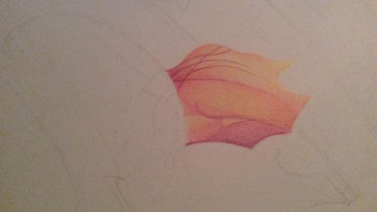
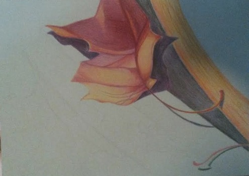
I used prisma colored pencils for this leaf that i have saved in my sketch book from my last project. I did a single leaf and did multiple warm colors such as yellow, purple, red, orange, and pink. The reason I did a leaf is because I love how it had different areas or shadow and light. Making it fun to use different colors. Through out this project I liked how the ends of of the leaf are brighter showing how it is more see though there. Towards the middle where the stem follows all the way though the leaf is darker. It is darker, because the veins as well show the different sections of the leaf. I didn't do a background because I thought it would show the colors on the leaf as well as they do on a white background. I love how the prisma blends over top of each other, so that the different sections aren't in blocks. The yellow sections are where the leaf was the most transparent. Since this leaf was aging it was getting more transparent and crinkly.
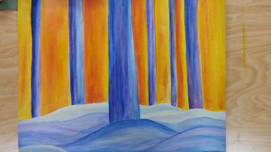
This choice project for me was difficult, because it was more towards last minute. I wish I took the time and thought it through first. I now realize that putting objects in the middle of the paper is wrong. My favorite part about this is the colors of the trees and how it is against the bright orange and yellow. I tried to make the orange sky reflect on the snow, so it would look more towards the end of the day. I tried to make everything in the vertical shape. I didn't put much details in the tree, because I wanted it to look faded and glared and sort of foggy. I thought of this by having a picture from last year of trees and snow. I made this my own. I figured by making the ground bulky it would represent snow. I made the colors dark blue to make it look cold. I also used purples and a bit of red. I also put red into the trees hoping it would make it look like the trees are absorbing the heat from the sun. Through out my piece I enjoy the contrast. I wish I took more time with this. Overall I like it.
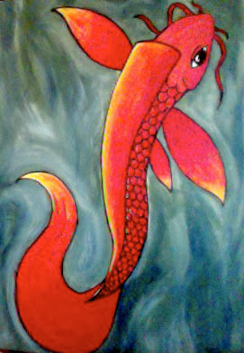 It took me a long time to figure out what to do for my choice project. I Took a previous koi fish drawing I did for homework and used it as my reference and made it into a painting. The outline is used in sharpie. I always forget to do the background first, so i had to go around the fish. Doing so, I like how it came out because there is more texture to the water and makes the fish look like its moving. As well as the tail. Especially how it goes down the back whipping back to the top. Getting the transition to the red, orange and then yellow was difficult, because I wanted it to blend but not so that it would mix. I left the eye blank from paint, because I thought it would pop out and give the fish more of a highlighted realistic feeling. I picked the warm colors in front to make it stand out more making the fish seem like its on the surface of the water. The colors I chose for the water were a mixture of white, dark blues, and earthy greens. Keeping the white around the koi defining ripples and highlights. I was debating on if I should have put a lilly pad with this painting, but I wanted this to be bright and to have one focal point. Im happy with this, because it has a semi-realistic theme and how I used bright colors.
 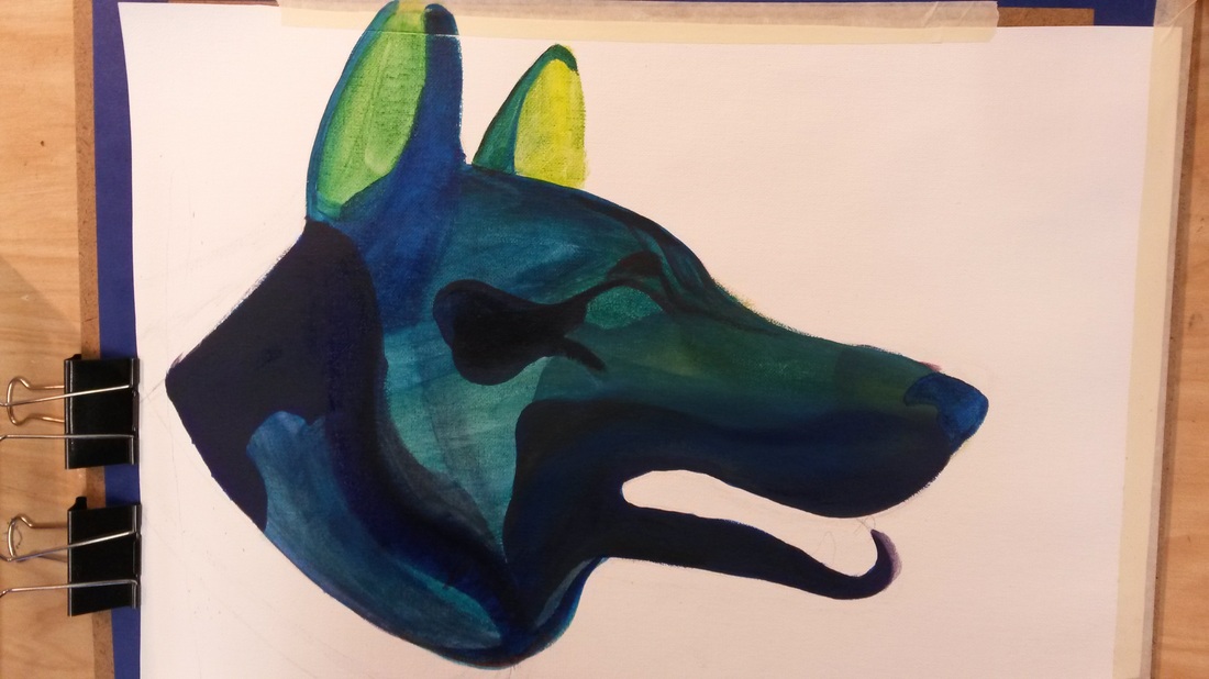 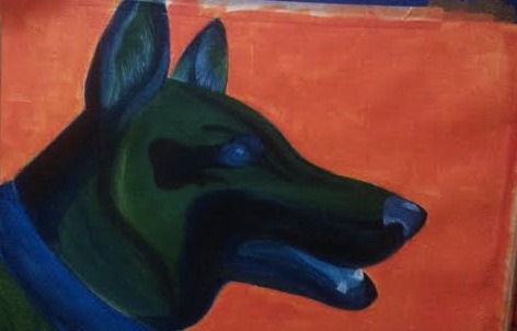 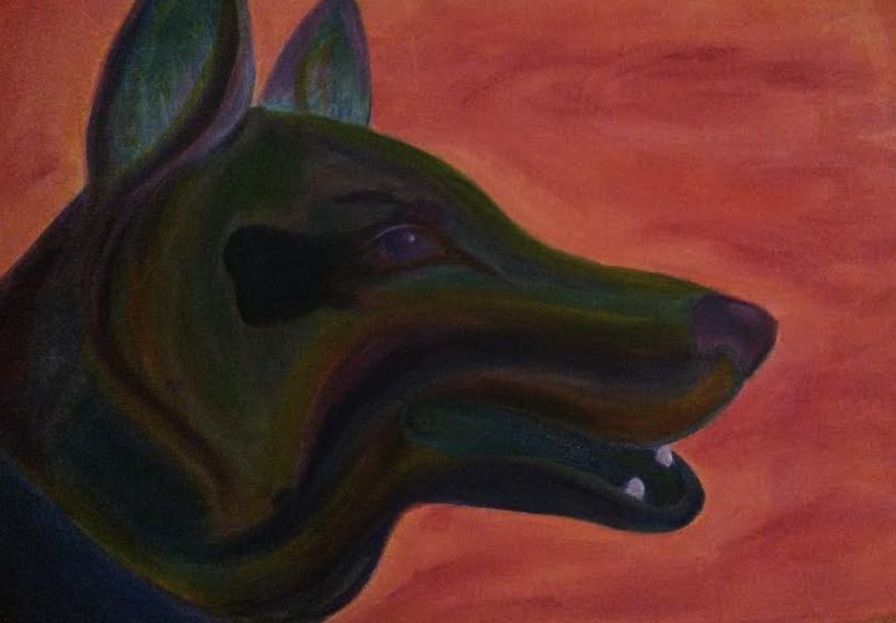 I have finally finished to the point where I don't hate it too much. This project was difficult for me, because in general I don't like doing portraits of living objects. Since I choose to use a colorful palette I feel like I can't accomplish the realistic concept of a self portrait or in this case a pet portrait. The ending of this project I figured with more practice I can prove myself wrong. I am happy with this ending piece. This is my dog, Koby, who isn't here with us anymore but still in memory.
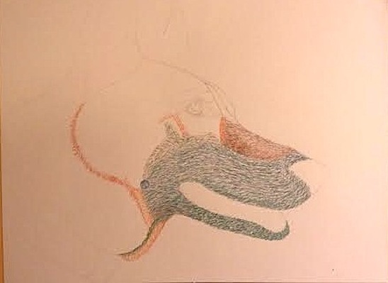
The beginning of this project I was searching for a medie where I can show the flow of fur easily. I chose to do colored pencils at first. Since I joined the colors of orange and green, as you can see, it started to turn muddy. I set that aside and decided to use acrylic paint. The first picture of paint above was turning out how I wanted it to, but then I tried to add more yellow and a darker blue, which then turned out not how I expected it to be. Over Christmas break I didn't touch it at all. Knowing I had to finish and accomplish it I wasn't feeling motivated. I got new paints recently and one of my favorites is a dark purple. I incorporated the purple into my pet portrait and I was happy how it was turning out. I added yellow, orange, and teal. The ears had the most teal and brightest color, so I did a few streaks through out the face and teeth trying to make it even. The hardest part was the eye. Trying to capture the right amount of light and life was super difficult. I think I managed it pretty well towards the end. The explanation for the bright background is because I thought using complementary colors would bring out the darker colors in my dog. 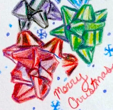
These bows for me were difficult. I started out doing a big piece, but ended up going really small and making it my own.
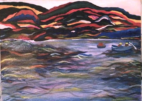 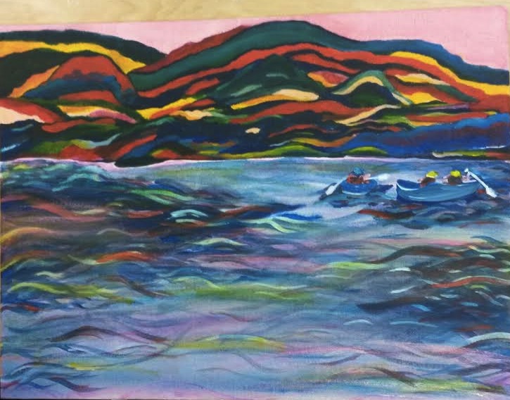 This project was difficult because paint isn't my highest talent. Since it was a landscape I had only a few places to choose from, so I chose a place where my family went called Zaloos Canoos. Where went went down a river and paddled 3 miles up rapids and down. This moment to me is happy and fun, which is why I chose these colors. What I thought was difficult was painting the canoos and paddles since they were small and more detailed/ The water was the easiest part because i layered down the same colors as the mountains trying to show the reflection from them. On top I did a wet base of yellow to really pop out the colors. The mountains were fun to paint because they were random but you can still tell where the different parts are and definition. I wish I thought this more through with the colors, and shapes. Although I do like this piece it should have been more thought through. Using the pinks and reds showed highlights and definition while the blues and purples showed shadows.
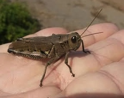 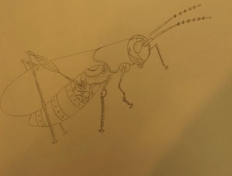 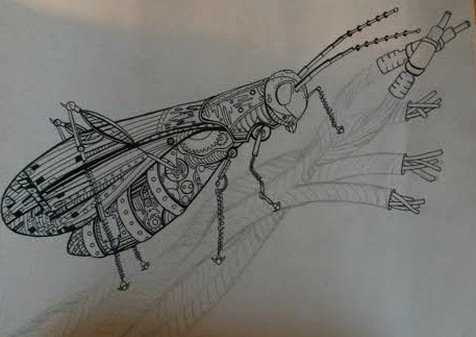 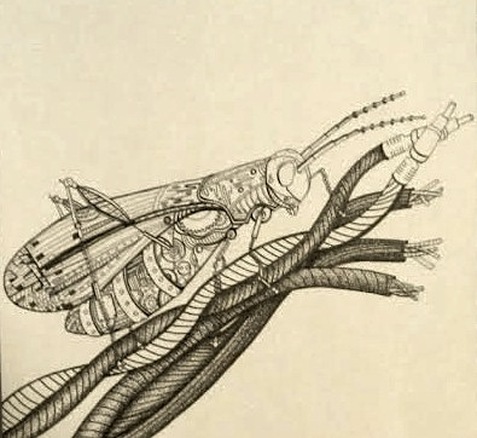 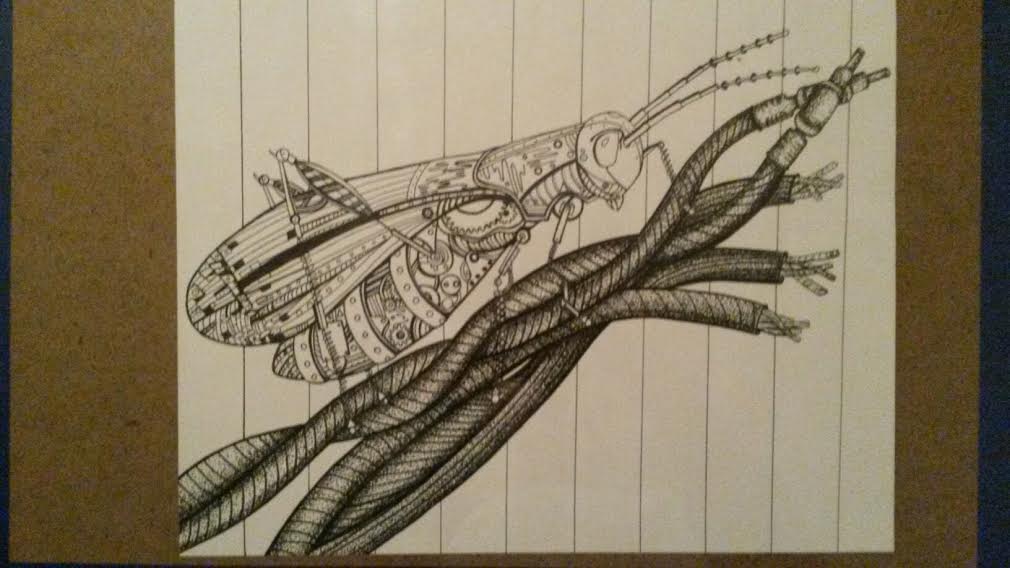 This project was really fun! I am almost done I do not want to rush it even if it is a bit late. I'd rather it be perfect and late than silly mistakes from rushing. Anyways my process to this point started from trying to think of what I was going to do. At first I was thinking of doing bright and colorful natural objects, but I had this amazing picture of a grass hopper. Since most insects have an exoskeleton/armer look to them I figured I can make it look mechanical. Since I wasn't sure of what mechanical objects look like I had to get many references for those parts. Otherwise I mostly did screws, dots, patterns, and wheels from the inside of a clock. For the wings it was difficult because I didn't want to put metal on it thinking it would seem heavy, so I put the different patterns of squares, circles, and screws. For the legs, which was my favorite part, I put springs on them to show the hop of the grass hopper. The real life picture of this insects feet were very interesting. It had sharp hook-like features on the sides and rounded ends(feet). Obviously to hold onto grass and such. Which then lead me to the wires. These wires are representing grass. I knew from the start that I was going to do this idea. I messed up making the outer lines too thick not showing any depths and taking away form the grasshopper. To show depth and give life back the the grasshopper I chose to do stippling. Stippling is a long process and I do have patience for it, but time is the problem. Once I finish the wires I will move to the background. I honestly have to idea what I should do for the background, but soon enough I will figure it out. I was thinking of keeping it blank because the foreground is already so busy and crazy. Other than the unfinished piece I am happy with it. Once I finish I promise to update my blog. Hope you enjoy my overall process, Thanks!
  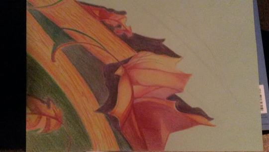  This project was something i can choose for myself. It was difficult to come up with an idea, but I decided to do leaves in colored pencils. Since I'm not used to using that media this project, i think, looks a bit rushed towards the filled in areas. I wish I put more time and thought to it. My favorite part about this pice is the leaf, which is the center of this. I love how the colors and shading/highlighting came out. My least favorite part is the filled in green spaces, because you can see the pencil strokes. It was hard for me to finish this project because I wasn't very motivated towards this peice, but I like how it turned out. I know I can do better. It was just time that I didn't take advantage of. Anyways I love the leafs and shadows and perfect for this cold weather and Thanksgiving time.
|
 RSS Feed